AutoNation UX/UI Design
A UX/ UI portfolio for America’s Largest Automotive Retailer
Empirical
The Race For Cogency
In the spring of 2015, I was called to interview with the UX Strategy & Design Team at AutoNation. I remember the excitement that came over me to have had the opportunity to be employed with the nation’s largest automotive retailer and to be a part of the corporate giant that one of my heroes, Wayne Huizenga, had created. The position came with the added bonus of working with visually stunning assets and a plethora of digital enterprise solutions that I would be contributing towards as a UX architect and evangelist.
Of the three designers that were hired, I was the only employee that expressed an interest in performing in a dual role as both a UX researcher and designer. It spoke to the core of my philosophy that the more intimate you can become to understand the motivations of the end user, the better the experience you can design and provide for them. The measure of that quality could only be achieved through applied research, analysis, interviews and focus group events.
Additionally I was responsible for designing UX solutions for web pages in advance of the launch of the new AutoNation website, as well as other sorted projects in the AutoNation digital ecosystem like the AutoNation Kiosk App, Showroom Selling Tool and Compass, their enterprise CRM platform.
View My AutoNation Compass Case Study
My Project Roles
Software Utilized
Axure RP
Photoshop
Illustrator
InDesign
Acrobat
Dreamweaver
Sitecore
HTML
CSS
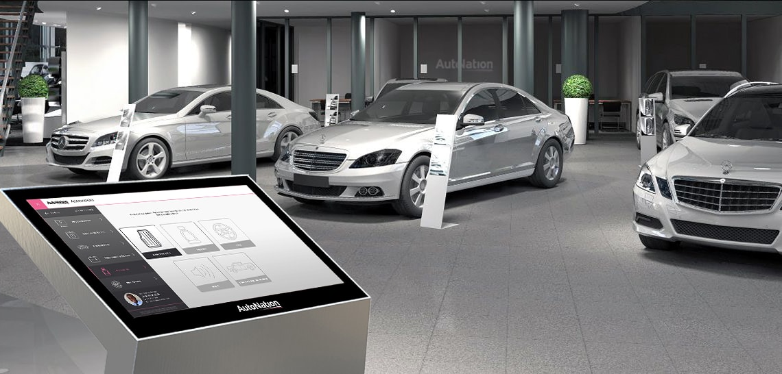
LARGE SCREEN UI DESIGN
AUTONATION DEALERSHIP KIOSKS
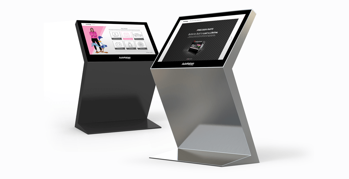
Looking to deliver on the promise of deeper, more meaningful shopper relationships, AutoNation introduced stand alone kiosks at their dealership locations nationwide. The AutoNation Kiosk unearthed unique challenges with regards to designing for customer-facing large screens and required the commitment of the entire UX design team.
I was tasked with providing UX solutions for the ecommerce module portion, presenting third party after-market accessories to inquisitive and prospective buyers visiting the car dealership.
In the UX engineering phase of the project, I created wireframe mock ups for the initial kiosk screens to galvanize debate and support from the UX design team pertaining to architecture, navigation, and interaction design. In solving for UX, I wanted to provide visually appealing designs that not only inspired and attracted car shoppers, but also encouraged the casual browsing of after-market product offerings.
Guiding Principles
- Employ effortless, lightweight interactions to offset the physical costs of standing for long periods of time and reaching to interact with UI elements.
- Integrate swiping gestures to allow users to browse the product catalog, minimizing the interactive cost of tapping, typing, and moving between screens.
- Implement larger product tiles with reduced textual content to improve the visibility of important details and features.
- Design call-to-actions with the proper balance of weight and size in proportion to the space of the large screen, making them prominent and impart an immediate and satisfying response to every tap.
- Devote greater attention to where elements that are positioned in the large field of view, accounting for variables in user height, arm motion and reach.
- Commit to an unyielding consistency between page layouts to bolster user cognition and memory for where UI touch targets are visually located on the screen.
The visual design of the AutoNation Kiosk would adhere to corporate branding standards to convey a unified look that aligns with AutoNation’s ecosystem of digital products and dealership signage. My intention was to procure a modern, sophisticated interface that was easily approachable and accessible to a wide range of users.
As a person who grew up watching Bugs Bunny cartoons, it was a personal treat to coalesce the infamous Warner Bros. Road Runner as a design asset in my visual design deliverables.
Balancing the complexity of the automotive retail marketplace with the simplicity and banality of browsing for extraneous after-market accessories to make your new car more exciting to take home, the UX design considerations were taken into account, and were incorporated and extended into the final impression of the AutoNation Kiosk UI, assisting AutoNation in developing and defining the user experience in-situ at dealerships nationwide.
UX Research
Competitive Analysis
Before I joined the AutoNation UX Strategy & Design Team, competitive analysis was handled by cherry picking features to review from competitor websites. While this was an efficient way of collecting data to make informed decisions, I presented the idea of conducting deep dive competitive analysis of whole websites.
I produced large thirty to forty page research decks that were then distributed to corporate stakeholders providing recommendations on best/ worst case scenarios.
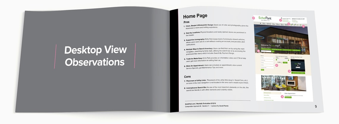
Usability analysis included several techniques utilized to conduct independent research on multiple aspects of competitor products and experiences. It was a unique opportunity to practice human-centered design by discovering user insights that I could translate to make a real impact on how we innovate design for AutoNation’s digital desktop and mobile products.
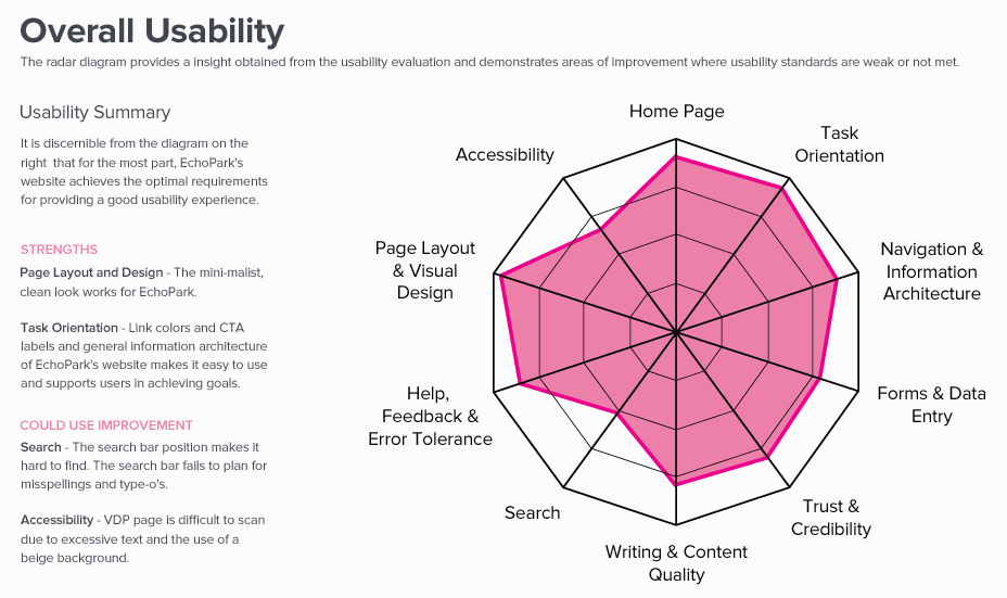
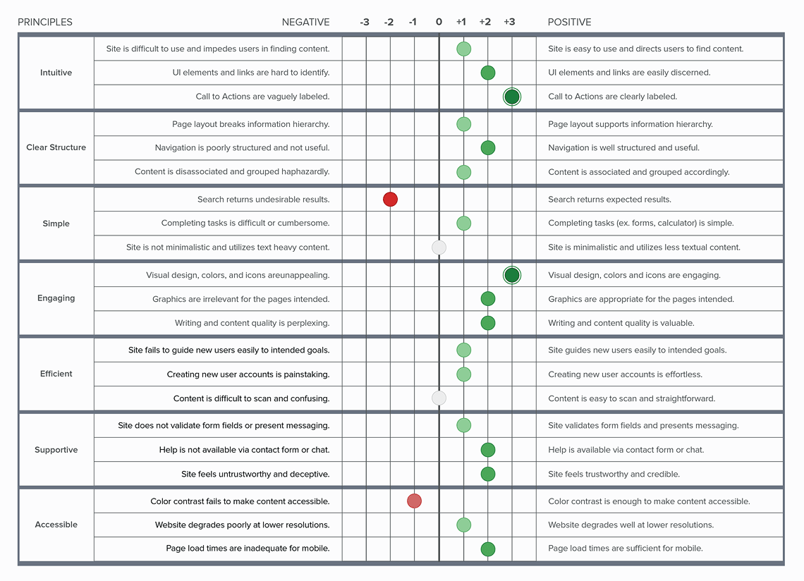
User research, heuristic evaluations, polarity profiles, and user journeys (empathy maps) were among the tools appropriated to document and design visual interpretations of the data highlights.
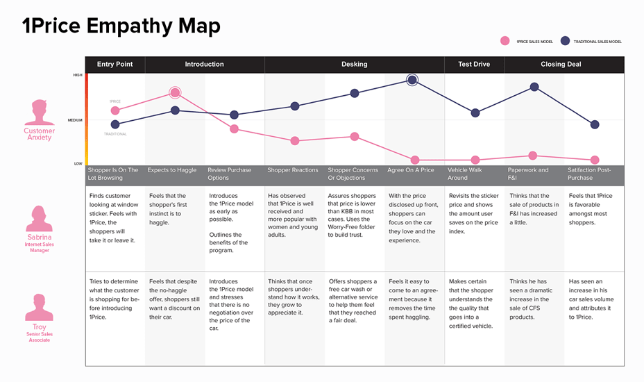
Even the most poorly designed websites and experiences can provide some actionable insight, even if it denotes simply what not to do. In such a competitive industry, there was value in keeping apprised of what AutoNation’s competitors were up to. By identifying usability issues on competitors we could improve or avoid creating issues of our own.
By monitoring competitive and complementary product experiences and trends, I was able to document best practices and identify opportunities to deliver innovative and immersive creation, sharing, and selling experiences. Notably, at the core of my competitive analysis reports were specific pages and functionality on both desktop and mobile media screens whose best moments were aggregated into an AutoNation UX Recommendations actions list.
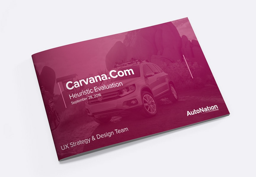
In September of 2016, I completed a competitive analysis deck for a new and trendy online-only automotive retailer called Carvana. What was first perceived as inconsequential due to the difference in business models, erupted in a firestorm of urgency six months later when Carvana’s marketing prowess was gaining traction in the market.
My research was used as the foundation to further explore appending an online exclusive car shopping experience to the AutoNation model. While Carvana today still owns this market, AutoNation now offers a “Ship with AutoNation” as a result of the research I initiated.

UI DESIGN & PAGE LAYOUTS
Launching AutoNation.Com
I was hired in advance of launching the redesign for AutoNation’s new website. My first task was to complete the AutoNation Style Guide which would serve as a resource for the UX Design Team to guide and produce pixel-perfect page layouts. One completed, I would progress into utilizing the completed style guide to address page gaps on AutoNation.com and collaborating on meaningful and intellectually-satisfying projects.
Using a grid pattern and corporate style guide, I was able to produce responsive web mock ups of key AutoNation pages, instituting UX best practices and standards to convey a sense of consistency. After analyzing conventions behind successful ecommerce models, it seemed logical to replicate design patterns after what shoppers were already familiar with, browsing and purchasing their dream car from the dealership they trusted the most.
UX Research & User Testing
Advocating For Car Shoppers
When I interviewed at AutoNation, I was presented with the choice of working for the strategy or the design division of the UX Strategy & Design Team. Naturally, I was inclined and requested to belong to both. Being able to slide between roles, I was able to gain a holistic understanding of the wider challenges faced by AutoNation as an organization so that I disprove or validate axioms of UX beliefs and deliver visually appealing UI designs.
I performed as the lead content strategist and user experience designer for the redesign of AutoNation Compass. Additionally, I was solicited to operate as the product owner on behalf of the AutoNation UX Strategy & Design Team due to my project management background. As with any project, the first step was the discovery process. Our goal was to understand stakeholder and sales associate needs, as well as identify project constraints and generate assumptions.
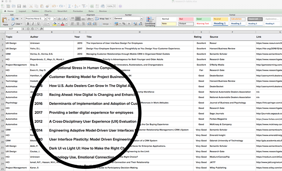
Voyeuristic Insight
The opportunity to actively participate in usability testing and focus groups at AutoNation was an invaluable and necessary experience to approach UX projects much more holistically than I had in the past.
I have always harbored an enthusiasm for observing behavior but while synthesizing user insights from pure research, feedback forms, A/B testing, or web analytics could be sufficient, the unfiltered real-time first impressions, natural reactions, snarky quips, facial expressions, and body language revealed the true sentiments that unequivocally would augment the way we designed meaningful products.
Focus groups covered investigating a wide-range of projects and business objectives including:
- Usability testing of internal applications and customer-facing software.
- User testing of feature implementation on primary pages on AutoNation.com.
- Group facilitated market research and shopper feedback.
- Employee intercepts.
- One-on-one device testing sessions.
- Validating sales process procedures.
Evolving User Personas
Unearthing Preferences Through Device Testing
Image Optimization Research
Improving Vehicle Photos
I was laboriously invested in a special project to improve the quality of the vehicle images on the search result and vehicle detail pages. I was to address a redesign of the image badging system, the process of overlaying the AutoNation logo and a specific offer/ feature to the vehicle image, as well as to investigate why the current images were pixellated and of poor quality.
The goal of the designing the new badges was simple. The badging was to intended figuratively stamp the vehicle images with AutoNation’s corporate branding. Secondly, badges needed to compete with competitor dealerships on car buying platforms like TrueCar, AutoTrader, etc.
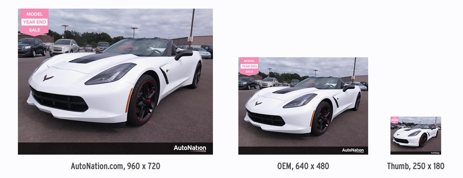
The original AutoNation badging that was used for many years presented several challenges, one of which that it required quite a bit of real estate. The badge itself, positioned in the top left corner, often overlapped and covered key details of the vehicle image. Additionally, the bold-condensed pink text within the badge was difficult to read.
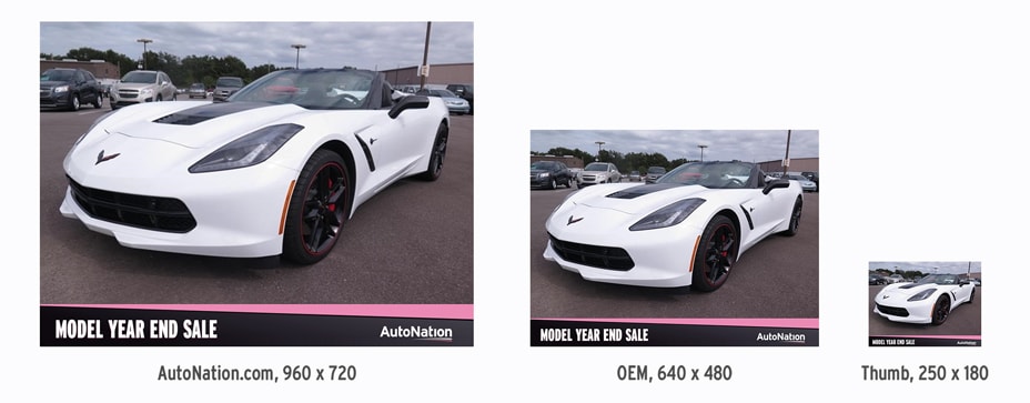
My approach focused on removing the badge element altogether and incorporated the use of a caption area where the special feature would be adjacent to the AutoNation logo. I enlarged the black bar slightly to give more prominence but never at the cost of impeding on the vehicle imagery. I utilized the road swish and vibrant pink branding to draw attention.
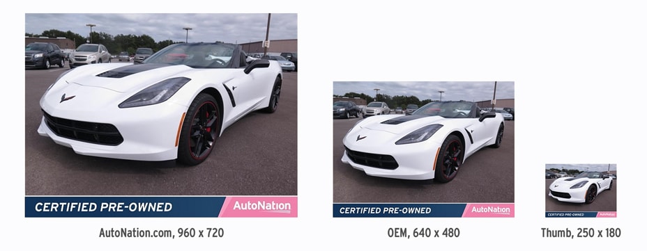
Our final version borrowed substantially from the corporate style guide by including the navy blue and pink treatment now used on all AutoNation marketing materials. Use of the Interstate font improved legibility when rendered for smaller screen sizes and thumbnails.
Additional credit: Alex Rodriguez.
Getting to the bottom of why images were presenting at such low fidelities required a bit more work. I was very astute with regards to the benefits and limitations of using different image file formats. From the outset, I wanted to present the stakeholders with variable options regarding how the images could be prepared, with respect to how compression impacts on quality and weight considerations for performance.
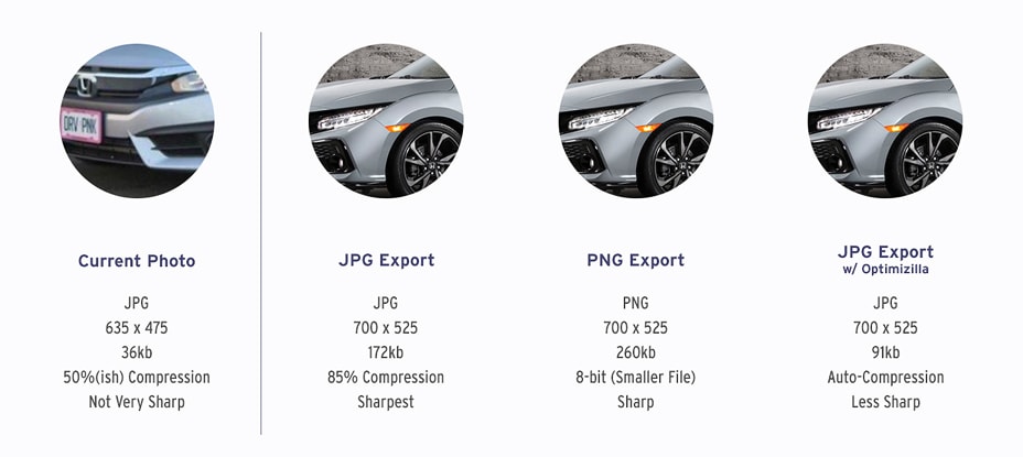
After several meetings and test trials, the image optimization settings did not produce the quality we expected. I sensed that external factors could be contributing to the poor quality of the vehicle imagery. I met with the Manager of IT at AutoNation to trace key steps in the life cycle of an image, from the moment the photographer exposed the photo to the moment it appeared on the presentation layer of AutoNation.com.
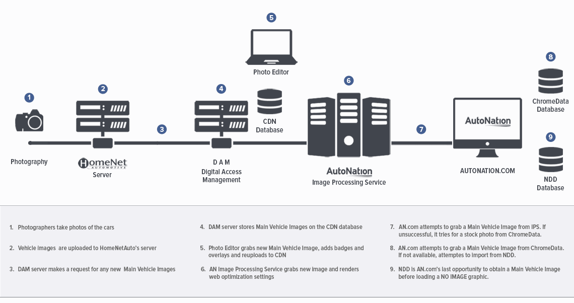
Diagramming the life cycle of product imagery provided invaluable insight, identifying two touchpoints in which image optimization services were being deployed on two different servers, causing the images to be compressed twice and causing a loss in fidelity. I was able to provide aid in defining technical nomenclature involved with server-sided scripts responsible for image formatting.
Working in tandem with the AutoNation IT department, corrective actions were taken and subsequently, the quality of vehicle images were greatly improved overall.
Selected Works From The Creative Lab


