AutoNation Compass
An Enterprise CRM UX Case Study For America’s Largest Auto Retailer
Empirical
The Road So Far
With over 26,000 employees across the nation, AutoNation’s proprietary enterprise-wide information system, Compass, empowers sales associates to be more productive, takes a snapshot of where customers are in the car buying process and drives dealership success, with increasing revenue and a centralized view of all metrics that lead to a sale.
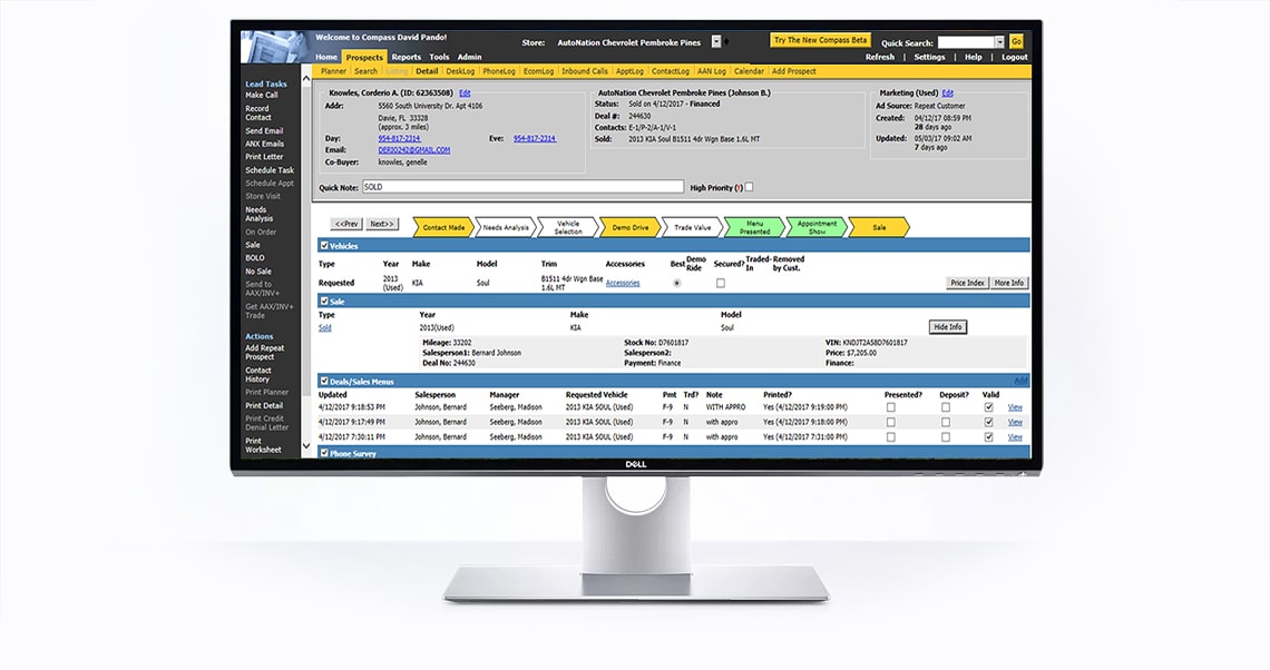
Advances in technology have rendered the fourteen year old software obsolete, requiring steep attention to identify areas of improvement with regards to overall design and functionality. Compass was a mature legacy enterprise application plagued by usability impediments that negatively impacted employee satisfaction and hindered the effective fulfillment of the sales associates’ daily tasks.
I led efforts to evolve and ameliorate Compass as an enterprise software solution and addressed sales associate pain‐points related to using Compass in the automotive retail experience.
To comply with my non-disclosure agreement, I have omitted confidential information in this case study.
The information in this case study is my own and does not necessarily reflect the views of AutoNation.
Project Roles
Software Utilized
MS Project
Axure RP
Sketch
Photoshop
Illustrator
InDesign
Acrobat
Apple
Android
Project Initiation
In Pursuit Of A Clear Vision
I performed as the lead content strategist and user experience designer for the redesign of AutoNation Compass, a large-scale corporate web application. Additionally, I was solicited to operate as the product owner on behalf of the AutoNation UX Strategy & Design Team due to my project management background.
As with any project, the first step was the discovery process. My goal as an aspirant UX researcher was to understand the user and stakeholder needs, as well as identify project constraints and generate assumptions. I wanted to draw from those research conclusions a curated product backlog of items based on requirements, restrained stakeholder appetites and technical feasibility.
Test Driving Software
I wanted to attain a personal exposure to the CRM system, so I immersed myself in a sandbox of Compass to try and imbibe all of the features and tools offered by the software. By using Compass to accomplish simple tasks, I evoked my own perception of what aspects of the platform needed immediate attention. Additionally, this practice helped me reference areas of concern in conversation with stakeholders by having an intimate familiarity having used the software.
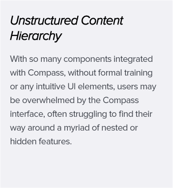
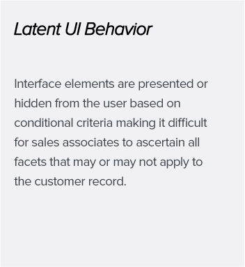
My initial impression of Compass was of being overwhelmed by the amount of content, perpetual links and lack of whitespace. The pages required intensive scanning to understand how to begin a task, of which many links brought me to broken pages. There were several layers of navigation with no distinction of how the content was grouped. And every click seemingly opened a new browser tab, which as they accumulated, became almost impossible to manage.
In The Driver’s Seat
A Compass Task Force was assembled which included the top leadership of the most influential stakeholders at AutoNation to establish a collection of assessments, explore technology metrics and create a backlog of desired features and improvements.
The goal was to establish a shared understanding between all parties with regards to how the new version of Compass would impact sales associates, customers, organization goals, and overall profitability.

Mark Akbar
Vice President of
Sales/ Field Operations

Addison Verklas
Senior Strategy Manager

Javier Romero
Senior Sales System Analyst

Famous Rhodes
Vice President of
Digital Marketing

Katherine Derrick
Director of Customer
Experience Design

Alex Miranda
Manager of Customer
Experience Design
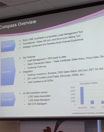
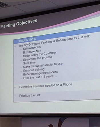
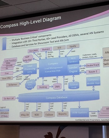
Photos from the Compass Task Force Kick-Off Meeting
I faced particular challenges of stakeholder commutuality with regards to retail sales and technical terminology between individuals on both the Sales Operations Team and the UX Design Team demonstrated how their unfamiliarity with each others’ industry would impact the project negatively. Acting as a facilitator for both teams, it was my responsibility to bridge communication gaps and technical uncertainty between the stakeholders themselves.
The Compass Complexity
Meeting notes after convening the Compass Task Force Kick-Off presentation provided me with a considerable checklist of project requirements and stakeholder expectations that I needed to prioritize based on importance, demand, and feasibility. Despite having established a backlog of coveted user stories, I knew that daily stand-ups were needed for me to extract the priceless tacit knowledge that stakeholders could provide me with from years of experience using Compass.
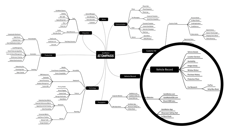
Working closely with the AutoNation Dev Team, I was able to get a glimpse “under the hood” of the fundamental operations, services and third-party integrations associated with Compass. I was discouraged by stakeholders not to attempt creating a site map, citing the boundless breadth of pages and links. Instead I opted to map out the differentiating services and flow of data being parsed on daily basis. It would provide me with a close overview of Compass’ inner workings.
A Simon Pan inspired technical mind map of Compass I developed through exploratory research
Superseding the technical conundrum that was Compass, I wanted to avoid investing too much focus on the technological intricacies at the expense of human and organizational related issues.1 Little attention is often given to the role of employees in the implementation of CRM activities, I needed to address the impact that adopting Compass had on AutoNation employees and consider how to motivate sales associates into adapting to a new way of thinking which included the emotional and behavioral changes manifested by the change in system.2
Concerns For Technology Acceptance
Many employers fail to notice that besides the consumers out there, the company also has other consumers. These are the firm’s employees who make use of various software applications to carry out their job on a daily basis.3 I was well aware that the “people factor” was a critical determinant of the success or failure of a CRM project, as a lack of user involvement would contribute to the failure of the CRM. A value mismatch could occur if the platform was easy to use and did not meet the staff’s core needs and preferences.

74% of dealership sales staffs nationwide don’t use their stores’ CRM systems because they think they’re too hard to use.
For CRM to be implemented, adopted and used effectively, the organizations requires to understand how to implement and get maximum benefits from a CRM. Among many failures of CRM is an organizations lack of bigger picture by failing to consolidate the data they have on customers from various users and systems and combine it with external sources like social media.4
Key Findings Regarding CRMs and Car Dealerships5
- Trials and tribulations are plenty, [CRMs] are arduous to install, the interfaces are “developer designed” and workflows lack true seamlessness.
- The UX on most solutions largely resembled that of a heavy desktop app, rather than a lightweight web app with some features lagging behind and the UI in need of an update.
- Internal dealership applications incorporate a complex ecosystem of products and tools which complicate the understanding of how to actually sell cars.
- A main reason why sales associates leaves their dealerships is because they feel the dealership never provided them with a plan to succeed.
- Ensuring end-user participation in using the CRM is rarely enforced by sales managers and upper management.
Addressing Roadblocks
The first step was to begin cultivating some form of project scope and codify fundamental perceptions of the challenges that I would face on both the UX and product management side. I knew that without obtaining a clear understanding of what Compass was responsible for, what problems it solved for AutoNation, or for whom it solved these problems, I ultimately could not begin to provide solutions for the best possible outcome.
I worked closely with the UX Director and the Senior Strategy Manager to define more precisely what features we thought would be a beneficial to improve or implement, and identified compelling flaws in the software that needed to be addressed in the redesign. My goal was to ensure that Compass solved pivotal organizational roadblocks and enhanced the car buying experience for customers by empowering sales associates with their greatest tool.
Driving User Research
Designing for EX, The Employee Experience
Practical conventions were available to help evolve the customer experience (CX) and the overall user experience (UX), but I found little research or data supporting the employee experience (EX), which was greatly needed to fully understand sales associate attitudes towards using Compass6 and how employees felt about how they manage their duties at over three hundred AutoNation stores nationwide.
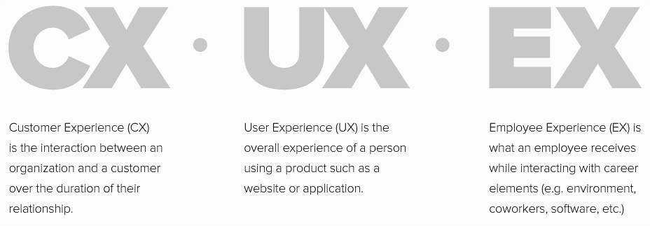
If the interface is outdated and overly complicated to use, then the user is bound to get fed up. This leads to lack of motivation, which will in turn affect the employee’s performance negatively. Nowadays, when we have gotten used to enticing layouts and easy-to-use interfaces. If one goes to work and ends up facing an obsolete interface, with dull colors, perplexing menus, and boring layouts, the employee will surely feel discouraged.7

The degree to which an individual believes that using a particular system would be free of mental or physical effort represents the degree to which a user’s perceived personal needs and the need to perform specific tasks satisfactorily are met by a system.
In general, attitudinal and behavioral change could only be possible if employees were willing to move beyond their comfort zone and trust that improvements made to Compass would be a catalyst for improving their quality of life at the workplace.

The best customer experiences bring the company’s distinctive brand values and attributes to life, and the same is true of employee experiences. If a company attends to its employee experience with the same level of discipline and intention that it does to its customer experience, the results can be seen across the board. Employees are more satisfied, companies enjoy higher employee retention and customers get better service.8
I assumed responsibility for the research methodologies that were leveraged throughout the content strategy phases of the development of Compass. I coreelated the research to help visualize and evaluate the journey from the employees’ points of view and gained insight as to what behaviors would provoke greater adoption of Compass.
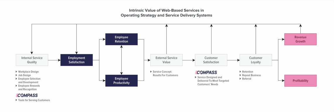
Employee Satisfaction Drives Profitability
For AutoNation, the value of investing in a CRM solution is crucial in order to service its vast and growing customer base. But where profit and growth are stimulated primarily by customer loyalty, the conduits driving those compelling interactions are the sales associates. Value is created by satisfied, loyal, and productive employees. Employee satisfaction, in turn, results primarily from high-quality technical solutions like Compass that enable sales associates to deliver results to customers.9
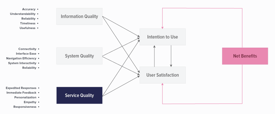
Sales associates rely on technology in completing countless daily tasks, but continuance in using Compass relies on three variables: user satisfaction, the confirmation of expectations, and perceived usefulness that represents post-adoption expectations.10
Mobility and Ubiquity
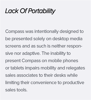
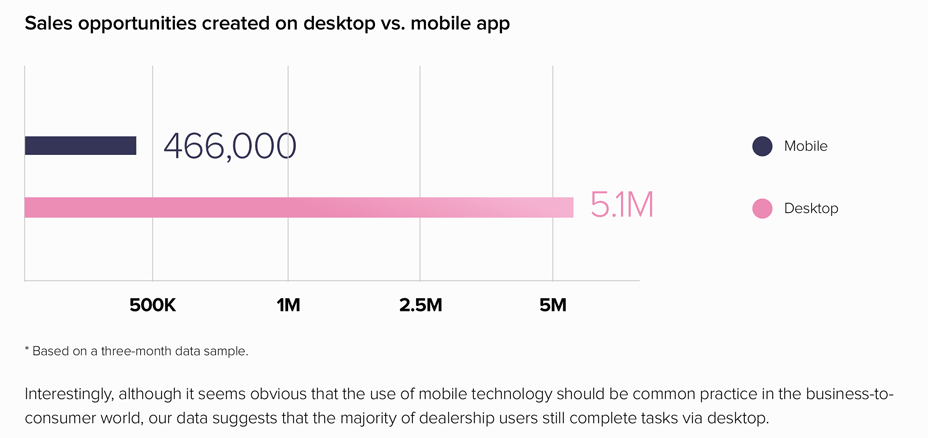
The biggest enhancement for the redesign project included translating Compass to present on mobile devices, a highly petitioned request by sales associates and the Sales Operations Team. By expanding the boundaries of Compass, immediate feedback is possible through sending and receiving customer information on a real-time basis which substantial increases employee and customer satisfaction alike.
Configuring Compass as a mobile-CRM inherently became a medium for channeling technology adoption by offering mobile communication services to the sales associates.11 This introduced an immense potential to enhance the employees’ work efficiency and facilitated improved and personalized interactions with potential buyers.12 The sales associates could easily obtain customer information, anytime and anywhere.

Conducting Employee Intercepts
The UX Strategy & Design Team was invited to attend an AutoNation business event in Katy, Texas where we were able to conduct Compass-centric sales associate interviews. I curated a set of probing questions to support my research, hoping that aggregating unencumbered feedback could shed light on gaps in corporate knowledge and perceptions.
Enterprise applications generally suffer from numerous usability problems. I had lingering questions about how the sales associates felt when they interacted with Compass. I developed four pillars of inquiry to gain insight.
- Usability: Is the CRM generally easy to use?
- Adoptability: Was it easy for sales associates to learn the system as new hires?
- Desirability: Do sales associates feel the system meets their preferences?
- Value: Is the Compass platform inherently useful?

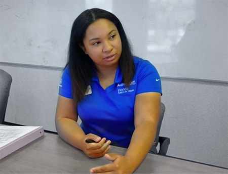
Interacting with the sales associates to hear their stories, frustrations and hopes for the redesign of Compass
Each interview was individually examined to uncover common patterns or themes emerging from the answers furnished. Apart from internally focused goals, the majority of the respondents put forward customer satisfaction and loyalty as indicators of a good system. They reminded me that customers could not be disqualified as a target group in my project research.
Generational Perceptions & Motivations
Taking advantage of AutoNation’s vast resources, I turned to marketing documentation and pure research to examine generational attitudes towards work ethic, work centrality, and technology acceptance. With Millennials quickly infiltrating the automotive retail industry, I wanted to explore what intrinsic work values had to be met in order for Compass to engage this generation to better serve the customer.13
In 2015, millennials accounted for a full 42% of the retail automotive workforce, and 60% of all new automotive hires. This digital-first generation is positioned to use today’s tools to better connect with customers and serve as their advocate and educator.
Empirical evidence on generational differences in work values consistently found that GenX, and especially Millennials, believe that work is less central to their lives. A study of U.S. information technology workers found that Gen-X scored higher in job involvement and normative commitment to the organization than Boomers,14 while the challenges of retaining Millennials, who were found to be prone to job-hopping, became apparent.15
Additionally, Millennials prefer autonomy, and want to be valued, to be stakeholders, not ’employees.’ They want their ideas to be heard and validated. Of their greatest asset, Millennials presented the greatest comfort and familiarity with technology, which made them the prime audience for Compass.
Evolving Sales Associate Personas
With practical scenarios in place, I was able to accurately define AutoNation’s target audience and began to develop detailed professional personas based on my findings, outlining conventional workplace attitudes and water cooler grumblings, classifying attitudes towards dealership software that could impede CRM adoption and providing several possible use cases for sales associates to accept the app.

If a company’s digital experience is a good one, employees can work efficiently and feel positive about their environment. While if a company’s digital experience is poor, the staff can become unmotivated and avoid using the systems that are critical to the organization.16 In the corporate environment, much of the modern employee experience takes place online. Expectations for digital experiences have grown higher and higher as employees compare every interaction to their best online user experiences.
GOALS FOR DESIGNING FOR EX:
- Compass is a tool for everyone in the dealer staff, not just sales associates and can be extended to promote a positive impact on customers.
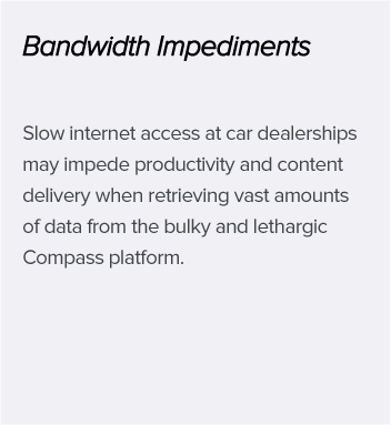
- Compass should be lightweight and mobile–device capable, making it accessible from anywhere and independent of dealership bandwidth limitations.
- Software ease of use and service (features) usefulness will contribute to company-wide acceptance and adoption of Compass.17
- The application needs to be reliable and needs to cater to millennial preferences to retain their engagement.
- Reporting metrics and productivity tools should establish a benchmark for personal accountability.
- Green Peas (new hires) should be able to achieve minimal acceptable performance and navigate the interface freely and intuitively.
- Every action done in Compass should elicit a reaction from the customer and moves them through the sales funnel.
- AutoNation can foster a culture of success by addressing the variety of automotive retail disciplines and imploring sales associates to use the tool.
Planning & Wireframing
A Mechanic For UX Engineering
Delving into the research revealed some big insights into how to frame the basic narrative of the Compass app and how employees would be using it. For several months I was the only team member actively meeting with stakeholders and producing project work on Compass, shifting seamlessly between product owner and UX architect, with a focus on establishing a core UX model that aligned with the requirements addressed by the Compass Task Force.
By aggregating the research data, stakeholder meeting notes and drawing from my own personal discovery process using Compass, I obtained a better understanding of how sales associates were navigating, searching for, and interacting with the with data. I now could begin the process of creating wireframe mockups to provide conventional recommendations and elegant design solutions that would augment the employee experience.

Wireframe Mock Ups Of Utility Menu Screens On Mobile
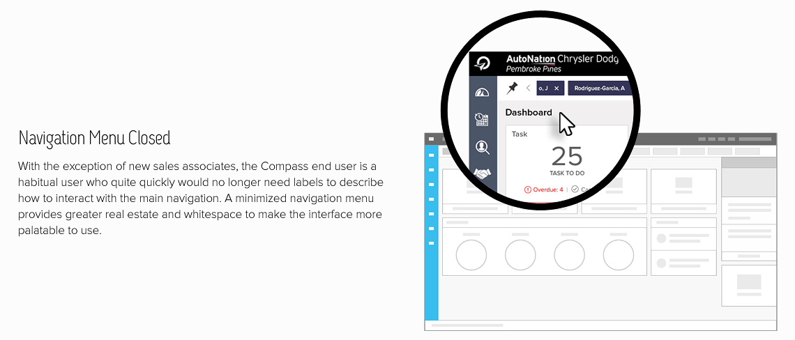
Excited by the prospect of re-platforming Compass as a feature-rich enterprise application, I was careful to avoid UI bloat and the pitfalls of introducing visual complexity by reducing the intimidation felt by users who were struggling with efficiency, performance, and the time it took to locate desired features with the previous version.19
I took the decision to focus more on the functionality and structure of the app, utilizing primary Compass screens as my foundation for wireframing and through progressive elaboration continued to add new features or improve on existing UI. I removed superfluous pages from the navigation and omitted redundant content. Iteration adjustments to the wireframes were based on feedback received from user testing.
New challenges were unearthed with respect to the stakeholders’ understanding of why wireframes were produced, how they should decipher the technical recommendations, and with many on the on the Sales Operations Team misinterpreting the wireframes as visual design deliverables of Compass. My experience at Canon USA as a corporate trainer afforded me the skills to facilitate and decompose complex technological concepts to guide stakeholders through proper interpretation of the wireframes.
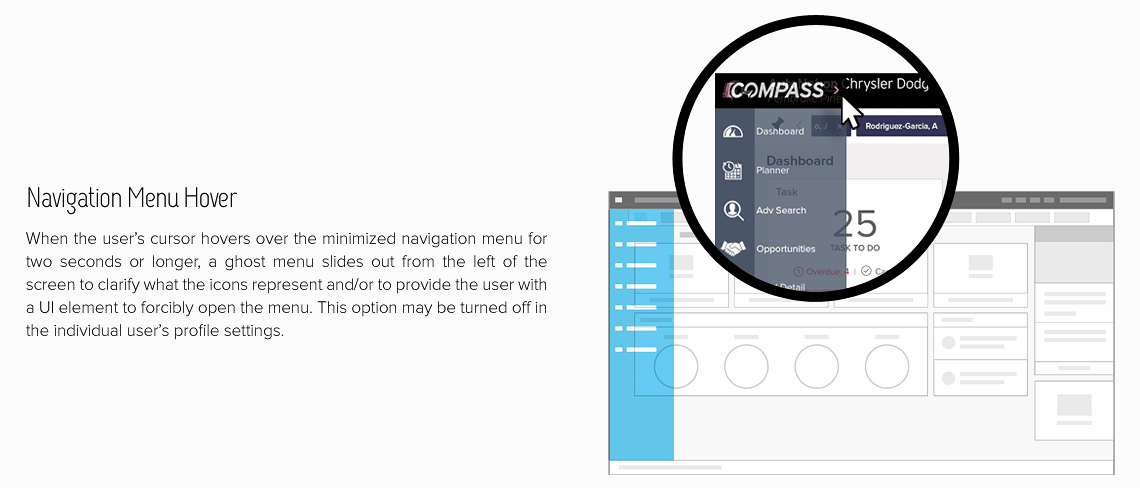
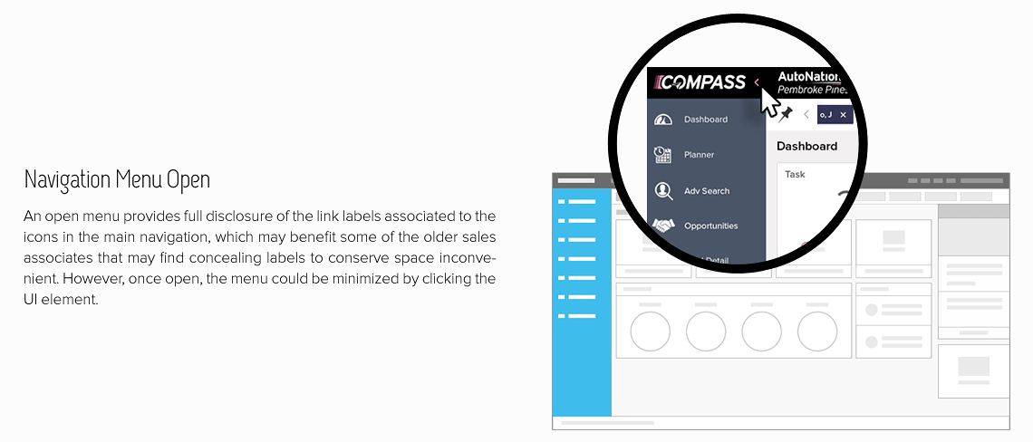
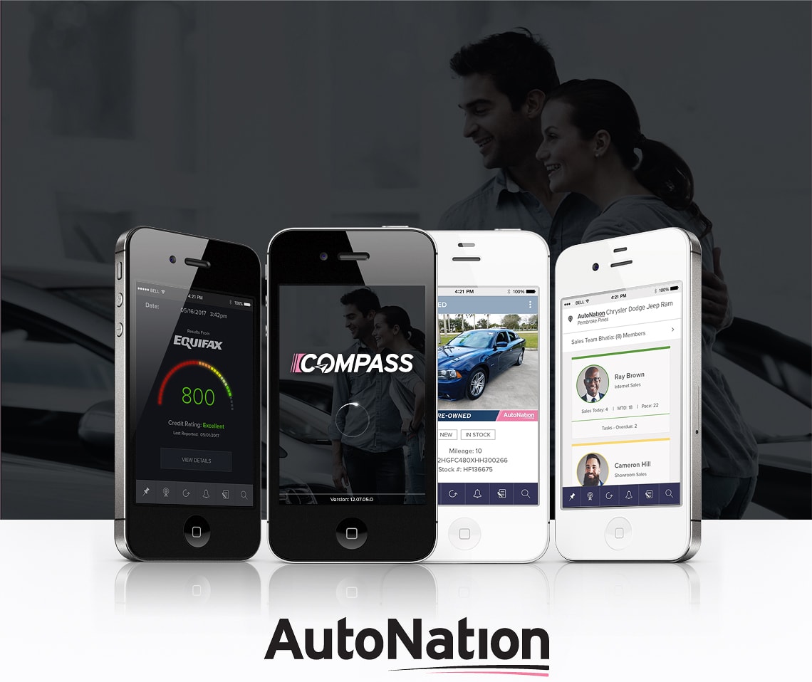
Designing for mobile presented an exciting and untraversed approach to Compass, confidently moving into creating wireframes to establish how employee-facing content and features would be baked into the interface for the first time on mobile devices. The enhancement would allow sales associates to use mobile devices to remotely access, update, and interact with customer data whenever they want, wherever they were.
Empowering the sales associates with a mobile-CRM promoted unique and positive experiences by mixing aspects of product, service, brand and communication that was based on maintaining positive and profitable relationships with prime customers.20 In the automotive industry, the speed of response and personalized service could bear increased CSI scores, customer loyalty, and retention.
Executing Visual Design
The Quest For Fuzzy Dice
When I first joined the UX design team, I helped to evolve the current brand style guides utilized on AutoNation.com. For Compass, I wanted to create designs that matched the overall AutoNation brand identity under one new consistent brand voice so that the digital experience across many outlets would be familiar to employees and customers alike.

In the early stages of production when you only have a car chassis to show, hang a pair fuzzy dice on it to make them happy.
The instructor of my ScrumMaster certification course was AgileDad, V. Lee Hensen who conveyed the importance of presenting stakeholders with fuzzy dice, eluding to the idea that when expectations are high and there is anxiety over perceiving productivity, the perception of “progress” is lost on the intangible activities of planning, content strategy and foundational code.
Building something as small as an MVP could impart the reassurance that project work was getting done. I needed to delve into visual design to produce quick deliverables for art direction and brand definition that stakeholders could connect to emotionally. I favored the idea of producing a treatment for a Compass logo as the introductory deliverable to the design phase of the project.
A Logo In Forward Motion
I took two approaches towards designing the Compass logo. On one hand I wanted the logo to feel familiar and properly align with AutoNation’s brand identity and style guidelines. With the recent launch of AutoNation USA stores and AutoNation Auctions, I borrowed the forward-motion font treatment and preceding pink trailer bars for Compass.

But I also wanted the Compass logo to be unique, if even just something small that set it apart from the other AutoNation logos. I introduced the concept of the Compass Needle which would become an iconic symbol easily and permanently associated to Compass.


![]()
Treading True North With The Compass Needle
One drawback of AutoNation’s familiarly textually-driven branding is the lack of iconic representation. Despite the double lines incorporated into the logo, AutoNation has been unable to consummate a recognizable symbol that could stand on its own, like the Nike swish or the McDonald’s arches.
I introduced the concept of the Compass Needle, an iconic design that could be imbedded in the textual treatment version of the logo or stand alone to represent the Compass application.
Symbolically, the Compass Needle invokes trust at a moment when the individual needs to find their way or to point the way to better leads, improved productivity and profitability.
Fashioned after the infamous Fed-Ex arrow, the Compass Needle always points to the right, symbolizing forward motion.
The Compass Needle at a 45° angle looks like a two lane highway disappearing into the sun and aligns respectfully with AutoNation’s love for the road.
The Divergence Of Light And Dark
The stakeholders on the Sales Operations Team favored the appearance of a customer-facing AutoNation application called the Showroom Selling Tool (SST), citing a preference for its use of intermittently incorporated dark screens. The VP of Sales insisted that Compass should be designed using a dark thematic approach and was completely at odds with the UX Design Team that adamantly objected to the request.
While the debate over Light UI versus Dark UI is ongoing in web design communities and forums, minimalist design trends and competitive analysis of corporate application conventions would make for a strong argument in support of designing a light interface for Compass. Light UI properly aligned with AutoNation’s existing corporate branding and was more prominently utilized on apps available to the public from major tech companies that have already invested on the R&D to support their style choices.21

An advantage of positive polarity (dark characters on light background) over negative polarity (light characters on dark background) was expected for younger adults, but the effects on older adults were ambiguous. In an ageing society, age-related vision changes need to be considered when designing digital displays. Visual acuity testing and a proofreading task revealed a positive polarity advantage for younger and older adults. Dark characters on light background lead to better legibility and are strongly recommended.22
But I also understood that the inclination towards darker themes was more of an emotional connection and personal preference. Providing research metrics that would support why designing using a light color palette would be favorable could be insufficient. After all, the most influential decision-makers on the Sales Operations Team were some of the most successful sales associates in the company. These were not individuals that typically took “no” for an answer.
In my role as a product owner for Compass, I was concerned over the schism between the stakeholders and acknowledged the threat that the disagreement posed to the project, overall production, and the delivery deadlines of my visual designs. I wanted to inspire convergent thinking and steer the stakeholders away from the conventional mind set of my “way, or your way,” to focus on a collaborative solution.
I decided to produce examples for mood boards, style guides and pattern libraries, for both the light and the dark implementations, in hopes the visual assets would steer the project vision in one direction or the other.
Reaching a Shared Understanding
After weeks of meetings, presentations and exhaustive deliberation, I balanced the corporate needs of our business stakeholders with the creative direction of the designers and successfully reconciled their prevailing concerns over visual design.
The following standards were established to guide visual design:
- Visual design screens and code development for one of the thematic treatments would be pushed to a beta release after the new Compass is launched.
- The color palettes, typography treatments, and UI design patterns I created would serve as a baseline for the creation of Compass pages.
- I was tasked to produce visual design screens for the main navigation pages in Compass to set a standard.
- UX designers were tasked to work under my supervision in helping to flesh out supplementary Compass screens.
At this point in the project timeline, the director of the UX Design Team granted me the assistance of additional UX designers to help with the design of Compass. With standards established I was to lead the team to continually explore and draw from them a diverse set of ideas and consolidate their best thinking.
Icon Sizes
In approaching iconography, a UX designer contended that the overall visual design should adhere to the style guidelines that we produced for AutoNation.com, indicating the trendy use of thin-line icons. The stakeholders were pleased with the presentation but I had my reservations about how the icons would present on mobile devices.
![]()
I was able to dissuade the use of the Baker-Miller Pink for the icons out of concern that the pink was overtly light and easily lost. But even when juxtaposed over dark circles, I also contested that the slender appearance of the thin line icons, while quite minimalist, would increasingly become illegible as they shrunk in pixel size for mobile presentation.
Inspirited with the courage to break away from corporate conventions, I redesigned the icons thicker which provided greater contrast for legibility and then presented a pixel-perfect comparison demonstrating why thin-line icons should not be a part of the Compass pattern library.
![]()
![]()
The Sales Opportunity Timeline
We borrowed from DealerSocket the concept of an opportunity timeline which provided the sales associate with a visual snapshot of what stage into the car buying process the customer had reached. But it also evoked an emotion from the sales associate by using imagery that encouraged the pursuit of the sale, bolstered a competitive spirit and was perfectly aligned with AutoNation’s company culture and strategic objectives.
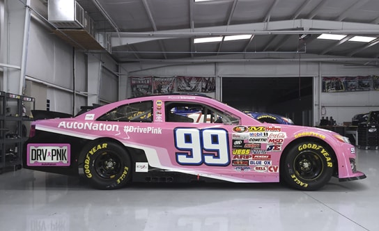
The concept of “racing to the finish line” came to mind and I drew upon AutoNation’s presence in NASCAR as my inspiration. Patrick Staropoli’s No. 99 AutoNation Cure Bowl Toyota race car made for the perfect subject of my design because it embodied several key fundamentals.
- Implementation of Nascar elements would resonate with fans of the sport. corporate leaders and sales associates.
- Crossing the finish line is to racing as reaching a sale is to the car buying experience, it is a motivation to work.
- Associates are figuratively racing against each other, emboldening them to push past personal limitations.
- Nascar vehicles are considered muscle cars that impart a feeling of strength, speed, and confidence.
- AutoNation’s presence in Nascar is a source of pride for the company as a whole.
- AutoNation’s national initiative in support of Breast Cancer Research is subtly represented in every sale.

Visual Design
I wanted to ensure that the visual design was accurately aligned with the employee experience, meeting sales associate preferences and providing features and functionality that they would expect from the new CRM. This meant that the interactions needed to inspire trust and confidence for the sales associates, and it was vital for those who wanted to assert control to know how to effortlessly discover the features they sought.
Supplementary to designing for EX, it was paramount that Compass should feel like an extension of the car dealership, adhering to the corporate branding and tone familiarly associated with AutoNation, creating consistent visual elements from mood boards, style guides and design patterns I established earlier in the project.
With employee CRM adoption as the driving force behind the re-platforming and UX engineering of Compass, decisions to better articulate and distribute design rationale were shaped by attributes of engagement consisting of aesthetic appeal, attention, endurability, feedback, interactivity, perceived user control, pleasure, sensory appeal and novelty.23
Selected Works From The Creative Lab

